Search this site
Why More Photographers Are Choosing Squarespace Cover Pages (Sponsored)
Cover Page by Dark Cyanide
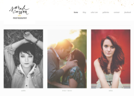
A great website is like a great business card: simple, to the point, and visually compelling. The internet is so often overly complex and convoluted, but it’s exciting to see all the ways in which photographers are maintaining the minimal elegance of the business card by adding Cover Pages to their Squarespace websites.
Introduced barely over one year ago, Cover Pages can be used either as a one-page standalone website advertising or announcing new work, or as is the case with most visual artists, as a front-page introduction to a wider portfolio.
Just a few months ago, Squarespace introduced a series of updates designed to make Cover Pages more dynamic and effective than ever. With more layouts to choose from, including 14 new ones, Squarespace Cover Pages can to do everything from playing videos to displaying social media accounts front and center.
In honor of the recent addition of these innovative Cover Pages features and formats, we spoke with five phenomenal photographers to learn about why they chose to include a bold, eye-catching front-page in their sophisticated websites.

Cover Page by Deborah Anderson
Initial Impact
The number one thing most photographers mention about their cover pages is the influence it has on viewers. Having one image displayed beautifully is usually worth more than a thousand confusing menu items.
Minneapolis-based photographer Teri Fullerton compares it to a curtain in a theater; in her words, her Cover Page “sets up the stage for what’s to come.” Photographer Deborah Anderson agrees, adding, “I feel my site is like going to a gallery space, and so my cover page is like the front door.”
Anderson adds that although we’re discouraged from “judging a book by its cover,” making a first impression is critical, especially when you’re a visual artist. Since adding a cover page a few months ago, Los Angeles-based Morgan Phillips has noticed a marked decrease in his bounce rate, meaning that more people are staying on his site without navigating away.

Cover Page by Sheri Lynn Behr
Lasting Impression
The magic of the Cover Page lies not only in that first make-or-break moment in which someone decides whether or not your site is worth their time. A great Cover Page speaks to artistry and professionalism, and those are the things that stay with potential clients long after they click elsewhere.
Phillips, for his part, got almost instant feedback on the beauty of his Cover Page, and photographer Dark Cynide’s followers have enjoyed the easy navigation provided by the intro page. Photographer Sheri Lynn Behr has received an almost overwhelming positive response to her Cover Page, and just recently, Pulitzer Prize-winning photo editor and consultant Stella Kramer told her that she uses it as an example for her other clients.

Cover Page by Teri Fullerton
Squarespace Cover Pages are affordable and easy to set up, and we love these photographers are using the tool to showcase their amazing work in a classic, lovely way.
Cover Page by Morgan Phillips
Squarespace is a Feature Shoot sponsor.


