Search this site
Behind-the-Scenes with a Renowned NYC Food Photographer
Whether he’s shooting a best-selling cookbook, teaming up with a celebrity chef, or telling the story of a beloved local restaurant, the NYC photographer David Malosh reminds us of the creative possibilities of food. Originally from Wisconsin, he’s built a career by capturing all manners of dishes around the country, from coastal oyster recipes to fancy, minimalist eggs and everything in between. Malosh has a unique talent for producing images that are at once surprising and simple, making him the go-to photographer for some of the biggest names in the food business.
When it came time for the photographer to create a website, he put his playful yet refined sensibility to work once more. Ultimately, he selected the website builder Squarespace to help bring his vision to life. Malosh’s images speak for themselves, so his Squarespace site places them front and center. Each page under his domain is a feast for the eyes, and it’s easy to lose track of time while browsing his diverse and colorful galleries. We spoke to Malosh about food photography, web hosting, and some behind-the-scenes secrets from the kitchen.
Why did you choose Squarespace to build a website, and what website template is your favorite?
“I chose Squarespace because it was simple. I’m not a huge techie; I don’t talk about the specs of a new camera or the latest software. That’s what digital techs are for, and I’m immensely grateful for their skill and technical knowledge. I needed to set up a website that was flexible and easy to update, one that I could manage myself.
“I think creatives have a tendency to overthink websites. We want them to be perfect. But photo editors and art buyers just want to be able to see images quickly and navigate through your site efficiently. I use the Wells template, which I modified a little. Wells is very straightforward in terms of design and navigation. I was looking for an opening gallery view plus big single images, which is exactly what the template does. A portfolio-based website shouldn’t call attention to itself; it should showcase images. It’s an effective design when they only see the images and the rest is intuitive.”
Your website design is so colorful and fun! Was it easy to add all these images and gifs to your homepage?
“Thanks! Images and gifs are easy to add. I size the longest dimension to 2500 pixels and then drag and drop the files in.”
What about your individual galleries? Why did you choose to display your images in this clean side-by-side layout, as opposed to a slideshow or something similar?
“Gallery views are the fastest way for an editor or art buyer to view a lot of images and (hopefully) find something they are into. I do like scrolling sites, but if you put an image at the very end of a long scroll, someone might not get to it. So I opted for a gallery.”
What was the most rewarding aspect of creating your own website rather than hiring an outside web designer?
“I don’t want to sound like it’s only about ease and efficiency, and I know there are incredible web designers out there, but I wanted a simple site that I could update whenever I felt like it. It’s nice to be able to put up a new gallery in a few minutes and to take them down when you want.”
Can you walk us through the process of collaborating with a chef? How much creative control do you typically have?
“Every job is different, and it depends on who approaches me for a particular book or project. Working directly with a chef tends to give me a bit more freedom because our goals are aligned from the start. We have a meeting and kick ideas around for a while to come up with something that suits the chef or the subject of the book. Cookbooks don’t always have an art director, so it often falls to me to pull a board together. I like to have a story or concept in mind when I shoot rather than just winging it. It gives consistency to a longer project that might otherwise go off in a thousand directions. I’ve also been lucky to work with chefs who are really excited to be doing a book and have placed a good amount of trust in me to make something interesting. They often see their food in a new way, which is exciting for everyone.”
Do you cook yourself?
“I don’t cook as much as I used to or as often as I’d like. I used to cook almost every night, and the more complicated the recipe, the better. I was into dishes that would take hours or days to prepare and had a laundry list of ingredients. I loved it when I had the time, but as my schedule got busier, I started cooking a bit less. I now sort of default to simple Italian and French cooking, 5-ingredient-or-less kind of stuff. I do make my own pasta, though. That’s where I draw the line.”
What are some differences between shooting a magazine editorial and shooting a cookbook?
“Magazine editorial shooting is usually much more scripted. A designer has already done a layout, and you’re essentially shooting the image into it. Editorial shoots take place over a day or two and you’re doing 8-10 recipes a day. It’s pretty hit-and-run. With cookbooks, you’re shooting for 10 days or more, and there’s time to get into it and make it all flow together. You get to know the chef and the rest of the crew, and it’s more familial. Cookbooks seem to have more freedom because it’s nearly impossible to lay them out ahead of time. That means we can make great images and trust a designer to do something even better with them.”
How have other genres, like fashion and still life, informed your approach to photographing food?
“I tend to look at still life and fashion images for inspiration more than I look at pictures of food. That’s not to say that I don’t keep up with what’s going on in food, and there are definitely food photographers I truly admire, but what I find interesting tends to be based on composition and movement in an image more than the food itself. Good composition is fairly universal, even if the subject matter is different.”
Have you learned any unconventional food styling tips along the way?
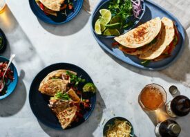
“The real styling tips I’ve learned are very simple: use good ingredients, make nice shapes, leave some negative space. And a bit of shine never hurts. The food we shoot is (usually) completely edible. There are a few things that still require tricks, like tacos… I’ve seen more strange things hold tacos together than I care to admit. Every client wants tacos to magically stand up on their own and also somehow stay closed. I’ve seen magnets, denture cream, and T-pins all work magic on flour tortillas. More than anything, though, stylists have taught me good cooking techniques: using higher heat, salting (especially fish) ahead of time and not cooking things to oblivion.”
You can try Squarespace free for 14 days. When you’re ready to subscribe, be sure to use coupon ‘FEATURESHOOT’ for 10% off your first purchase.
Squarespace is a Feature Shoot sponsor.


