Search this site
3 Photographers, 3 Different Approaches to the Photography Website (Sponsored)

Niki Boon’s Squarespace website
We recently introduced you to two brand new website templates by Squarespace geared specifically towards photographers. It’s always exciting to see how different kinds of photographers—ranging from big-time commercial image-makers to photojournalists to fine artists—take the sophisticated and constantly evolving portfolio templates Squarespace has built and make them their own.
We asked three photographers with diverse backgrounds to tell us a bit about why and how they have used Squarespace to create websites that are unique to their personal visions. Niki Boon, Kat Malone, and Colin Miller use three of Squarespace’s classic templates—Avenue, Bedford, and Wells— to tell vastly different stories.

Niki Boon’s Squarespace website
Niki Boon is unlike other photographers in that she and her family choose to live in a remote, untamed region of New Zealand with limited access to modern technology. She needed her website to be convenient, and after using another platform that took up hours of time, she switched to Squarespace because she could easily modify and update it in minutes, giving her time to spend away from screens with her muses—her children— doing what she does best.
Boon wanted her site to mirror the integrity of her life and less-is-more philosophy, without excess gizmos and clutter. For this reason, she chose the template Avenue, which enabled her to have only one show-stopping image on her homepage, with the option of a slideshow for visitors to navigate.
With Avenue, there’s no confusion: “People can flick through a sample of my images without having to look through various menu’s to find a gallery they were looking for,” explains Boon, “It looks quite dynamic and powerful in its simplicity.”

Kat Malone’s Squarespace website
It’s hard to believe that Boon and Kat Malone use the same website platform, because one of the only similarities is the cleanness and ease of use inherent in all Squarespace websites. Where Boon’s site is modest and subdued, Malone’s is lavish and luxurious, an aesthetic well-suited to her playful wedding and portrait photographs.
Malone chose the Bedford template to build not only her portfolio but also her blog, where she chronicles some of her favorite shoots. Bedford has allowed her to have one big cover photo, while one click inside the site itself opens up a world of imagery, punctuated by the artists’ poetic text. Using a more unsparing set-up has empowered her to take visitors on a visual and verbal journey; “I sell myself as an artist and a storyteller, and Squarespace does a dang good job of letting people see that,” reports Malone.

Colin Miller’s Squarespace website
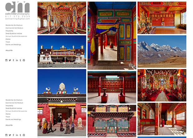
Somewhere in between Boon and Malone is Colin Miller. Miller’s site is both luxurious and restrained, an aesthetic well-suited to his cosmopolitan career shooting some of the most beautiful architecture and interiors in the world.
Miller selected the Wells template because it gave him creative license to show multiple images at once in a modern and tasteful way. “I choose to use Squarespace because the template designs were far more elegant than the previous portfolio template services I’d used,” says the artist, adding that the ability to have larger thumbnails of his photographs truly gives visitors “a sense of the set of pictures” at first glance. Says Miller, “I’ve sent out my website to clients, friends, and followers I’ve always gotten positive feedback.”
Get started with your own Squarespace site today.
Squarespace is a Feature Shoot sponsor.