Search this site
A Tiny Space with a Big Vision: A New Art Blog Curated by Sabrina Bajaj
Ever wish you could aggregate all the bright and creative people you meet in one place? Sabrina Bajaj did just that when she founded a tiny space toward the end of 2013. Part gallery, part online forum for conversation, a tiny space is Bajaj’s solution for showcasing the work of photographers, illustrators, and experiential artists she comes into contact with on a daily basis as a senior art producer for the ad agency, 72andSunny.
While its title may be small, the nature of the project is expansive in scope. And Bajaj’s vision is focused; her aesthetic on-point. Her website, created with Squarespace, is a tightly-curated grid of artists you wish you had only discovered for yourself. And when you click on a thumbnail image for each artist, their world is cracked open in the form of a clean, rich gallery of images and an interview in their own words.
Read on to discover how Bajaj designed her website to reflect her style and see a curation of seven of her favorite photographic works.
What resources do you use to find the artists you feature?
“I am constantly searching through Tumblr pages and blogs, though I still flip through my favorite magazines for new talent (New York Times Magazine). One site leads me to the next … blogs and Tumblr pages have proved to be a tremendous resource for finding talent.”
Photo © Joao Canziani
What is your criteria for deciding which artists to feature?
“I always try and look for something different as cliche as that sounds. There is so much out there that we have all seen before, so I look for an interesting perspective, color palette, or process. There are so many different mediums the artists are working in that attract me. There are artists all over the world that need recognition. I have featured people from places like South Korea and the Ukraine!”
Photo © Nicholas Alan Cope
How would you describe the aesthetic of the work you find most appealing?
“It’s hard to articulate exactly what it is that I find striking in a photograph, but I know it when I see it. Generally, I gravitate towards work that is non-commercial, experimental, and authentic in its approach.”
What was it that was so striking about this selection of images you chose?
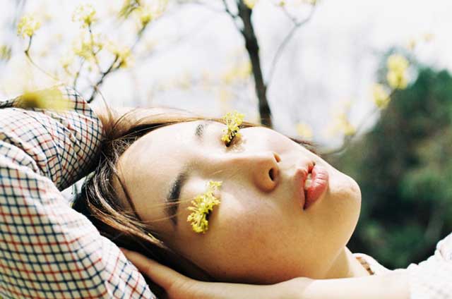
“It was hard to pick just seven, but my selection reflects my attraction to texture and lightness.”
Photo © Kyoko Hamada
Photo © Mark Peckmezian
How does the design of your website correspond with this aesthetic?
“The images are clean and simple, which is reflected in the design of the site.”
In what ways did you customize your website to fit your brand?
“I wanted it to feel simple and easy to navigate, literally like you are walking into a physical gallery. I think the customization comes from the curation and edit that I do with each artist.”
Photo © Nina Ahn
Photo © Charlie Engman
Why did you decide to go with Squarespace for your website?
“I started this with no knowledge about building a blog. Squarespace made it easy and user-friendly. It’s as simple as that.”
What do you like best about working with the platform?
“It’s very easy to edit images with Squarespace; for me the edit is everything. They also provide help when you need it!”
Photo © Billy Kidd
Squarespace is a Feature Shoot sponsor.


